Discover how Troy Web’s design team used Figma design system best practices to scale efficiency, consistency, and accessibility across software projects.
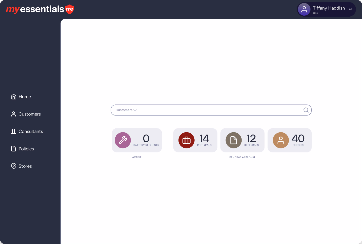
My Essentials is a complex platform used daily by customer service representatives (CSRs) to manage hearing aid insurance policies, devices, billing, and customer interactions. Like many internal enterprise tools, it evolved over time to meet new demands—delivering powerful functionality but also leading to a user experience that felt dense, inconsistent, and increasingly difficult to navigate.
When Troy Web was brought in, our goal wasn’t just to modernize the interface; it was to create a design foundation that would scale with the platform and support its users for years to come.
In this post, we explore 5 key design decisions that transformed My Essentials. This post also supports our full conversation on Building Better Software Through Design Systems, where our design team explains how enterprise design systems change the way software gets built.
1. Introducing a Dynamic Drawer for Contextual Editing
One of the first challenges was how to let users edit information—notes, policies, customer details—without losing track of where they were. Our solution was a dynamic drawer that slides in alongside the main content, allowing CSRs to focus on the task at hand while keeping context visible.
Jake Cooper, Senior Designer / Analyst, shared:
“The drawer just emerged as the smartest way to overlay information and editing without sending people to a different screen. It’s about clarity without compromise.”
This wasn’t just about one feature; it set a new standard for how editing actions worked across the platform.
2. Building Modular, Reusable Components
As we reimagined the interface, we followed Figma design system best practices by creating modular Figma components—cards, tables, forms—that could be used and reused consistently across the platform. These weren’t isolated fixes; they were building blocks for the future.
Ashley Garrett, Design Lead, reflected:
“Each pattern we defined wasn’t just about this screen or that feature—it was about creating building blocks for the whole system.”
This approach made it easier for the team to maintain UI consistency, iterate quickly, and onboard future features.
3. Establishing a Token System for Visual Consistency
A design system is only as strong as its foundation. We created semantic and primitive tokens for typography, colors, spacing, and corner radii, giving us the ability to maintain a cohesive visual language while staying flexible for future adjustments.
Jake noted:
“Tokens helped us make sure changes didn’t just fix one screen—they improved the whole platform at once.”
This allowed for a scalable design system without introducing inconsistencies or requiring massive rework down the line.
4. Focusing on Visual Hierarchy and Clarity
My Essentials had grown dense over time, packed with tables and options that overwhelmed users. We focused on restructuring layouts to improve visual hierarchy—grouping related actions, applying contrast and spacing intentionally, and guiding users naturally through their workflows.
Jake captured this shift:
“Not everything everywhere all at once, but everything within reach.”
The result was a cleaner, more focused interface that made work easier without changing familiar flows.
5. Embracing Incremental Delivery Over Perfectionism
Rather than attempting to design and deliver everything at once, we embraced an incremental approach. The design system grew in tandem with the platform, shaped by real needs as they arose.
Ashley summed it up:
“The system wasn’t something we paused to build. It was something we built by solving problems, piece by piece.”
This mindset kept the work aligned with practical goals while ensuring that the system remained adaptable and meaningful.
Final Thoughts: Small Decisions, Big Impact
The transformation of My Essentials wasn’t just about refreshing screens—it was about creating a design foundation that will serve the platform’s users well into the future. The lessons we learned apply far beyond this single project: modular design, visual clarity, and a flexible system can help any organization scale smarter.
For the full story behind our design philosophy, watch the complete conversation in Building Better Software Through Design Systems.
Want to bring these best practices to your organization? Book a Design System Consultation
Share this article