

Meaningful improvements in user experience (UX) and conversion rates often result not from major redesigns, but from small, targeted optimizations to a product's copy and micro-interactions.
The difference between a user who converts and one who drops off is often a single sentence.
When we think about UX, it's easy to focus on the visible things: layouts, button placements, navigation flows. But some of the most powerful UX work happens at the level of a field label. A section header. An error state. A single line of copy that tells someone what happens next.
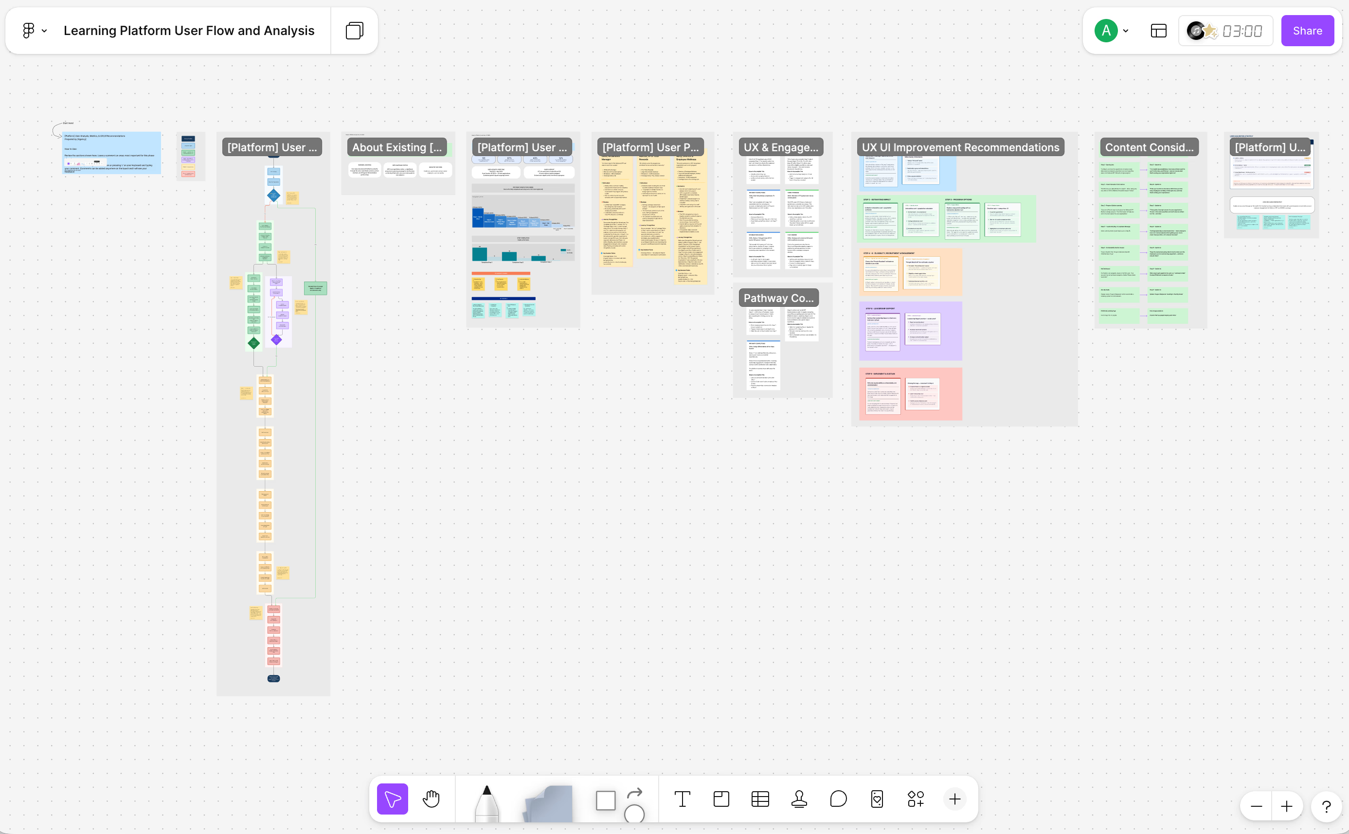
A recent analysis of the [Platform] user flow, a platform designed to help employers navigate and implement a national disease prevention program , makes this visible in a concrete way. The board maps a 9-step onboarding journey, and at nearly every step, it finds a gap between what the product says and what the user actually needs to hear. The fixes aren't redesigns. They're optimizations. And they reveal a lot about how meaningful outcomes happen.
Start With the User's Question, Not the System's Label
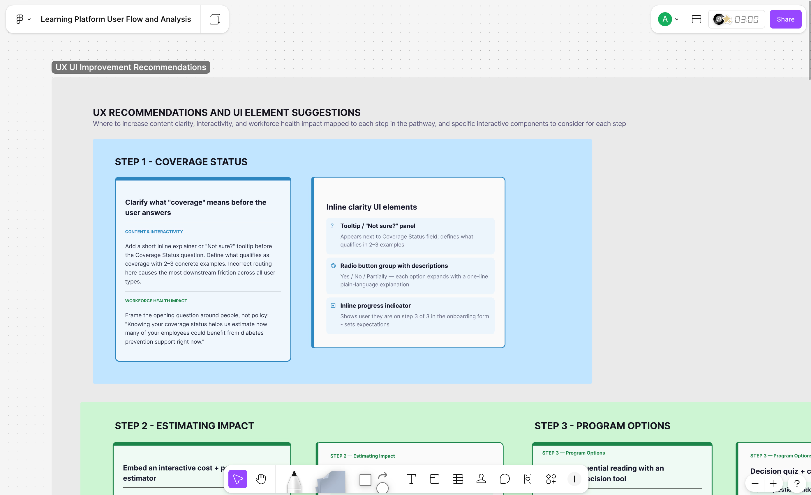
Step 1 of the [Platform] flow presents users with a field labeled: "Coverage Status."
It describes what the field is asking. But it answers the wrong question. The HR benefits manager sitting in front of it isn't thinking in system terminology. She's thinking: Do I have this thing? Am I supposed to know? What counts?
The user-focused improvement addresses all of that in one sentence: "Do you currently offer the National DPP lifestyle change program as a covered benefit? Not sure? Here's what counts."
This is a foundational UX principle: labels describe systems, but questions guide people. When you frame an input as a question rather than a field name, you shift the user from passive respondent to active participant. You also signal that the product anticipates their uncertainty, which matters more than most teams realize.
The practice is simple but often skipped: before finalizing any label, ask what question the user is actually trying to answer at that moment. Then write to that question.
Make the Outcome Visible Before the Work Begins
Step 2 originally opened with: "In Step 2, you have the opportunity to explore more information on diabetes prevention and more specifics about the National DPP lifestyle change program."
It's a perfectly accurate description of what Step 2 contains. It's also unmotivating.
The revision leads with the outcome instead: "1 in 3 adults has prediabetes. How many of them work for you? In this step, you'll find out and see exactly what that's costing your organization right now."
The first version tells the user what the step is. The second tells them what they'll know when it's done. One describes a context, the other promises a discovery.
This is outcome-first framing, and it applies everywhere in a product. Users don't complete steps, they move toward answers. If your copy describes the steps, you're making the work feel like work. If it describes what's on the other side, you're making it feel like progress.
A useful habit: for every major step, write the outcome first. Ask what the user will know, have, or be able to do that they couldn't before. Then build UI / UX around that.
Design for the Friction Points You Can See Coming
One of the most instructive moments in the [Platform] analysis is Step 8: Leadership Buy-In.
This is where users need executive approval before moving forward. It's also, predictably, where the journey stalls. Some users cycle through it multiple times. The original experience had nothing for them when that happened. A "no" from leadership just looped them back to the start with no message, no context, no acknowledgment.
The fix is one sentence: "Getting leadership on board takes time. Most employers have 2 or 3 conversations before getting a yes. You're closer than you think. Let's sharpen the case."
It normalizes the friction, reframes the setback as progress, and gives the user a next action. That's a lot of work for a few words.
The broader practice here is friction mapping: identifying the moments in a flow where resistance is predictable, then designing for them before users get there. These points are rarely surprises. They're visible in the logic itself: decision gates, required approvals, external dependencies. For each one, ask what a user needs to hear to keep going.
Serve Different Users Differently, Even in the Same Flow
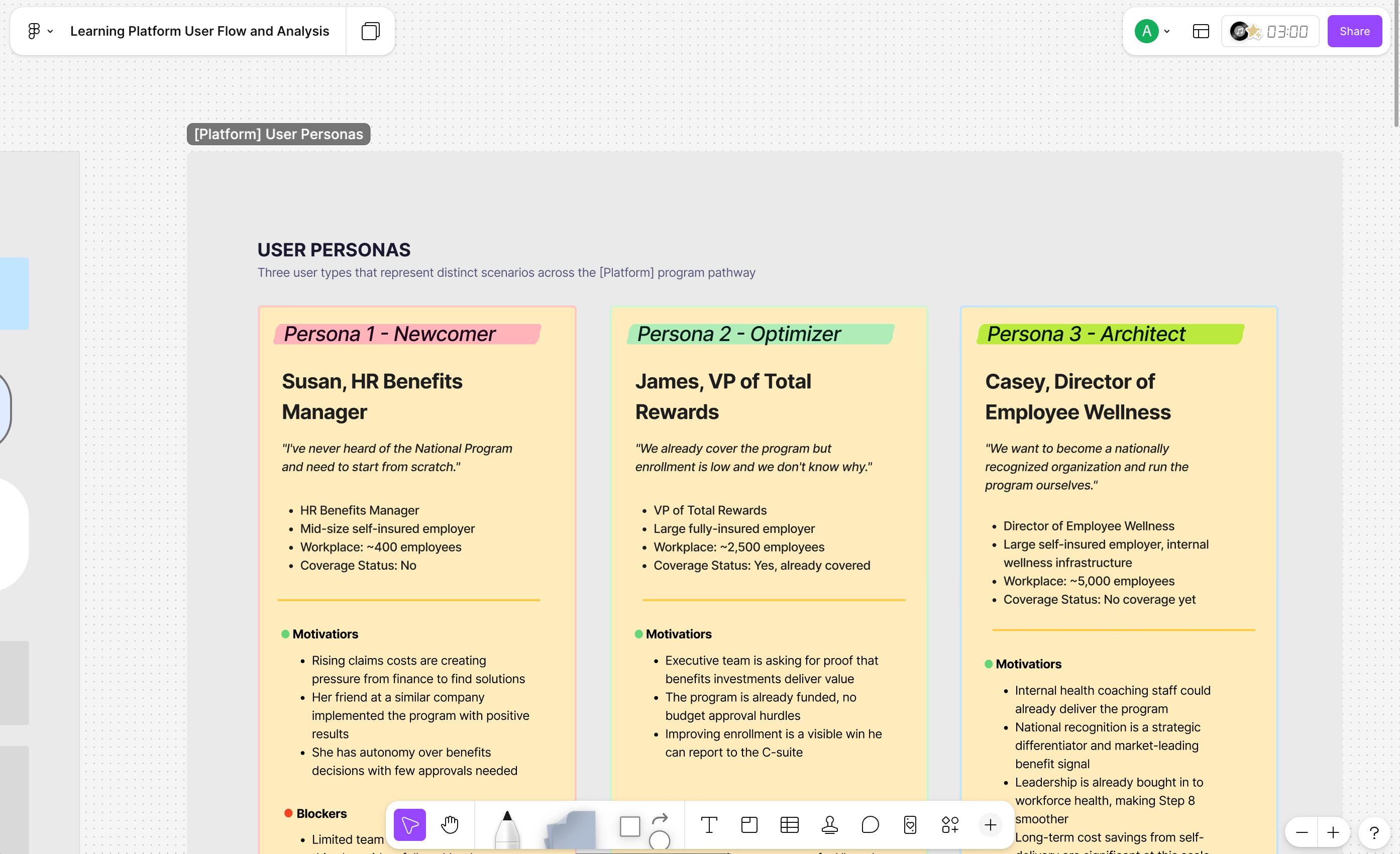
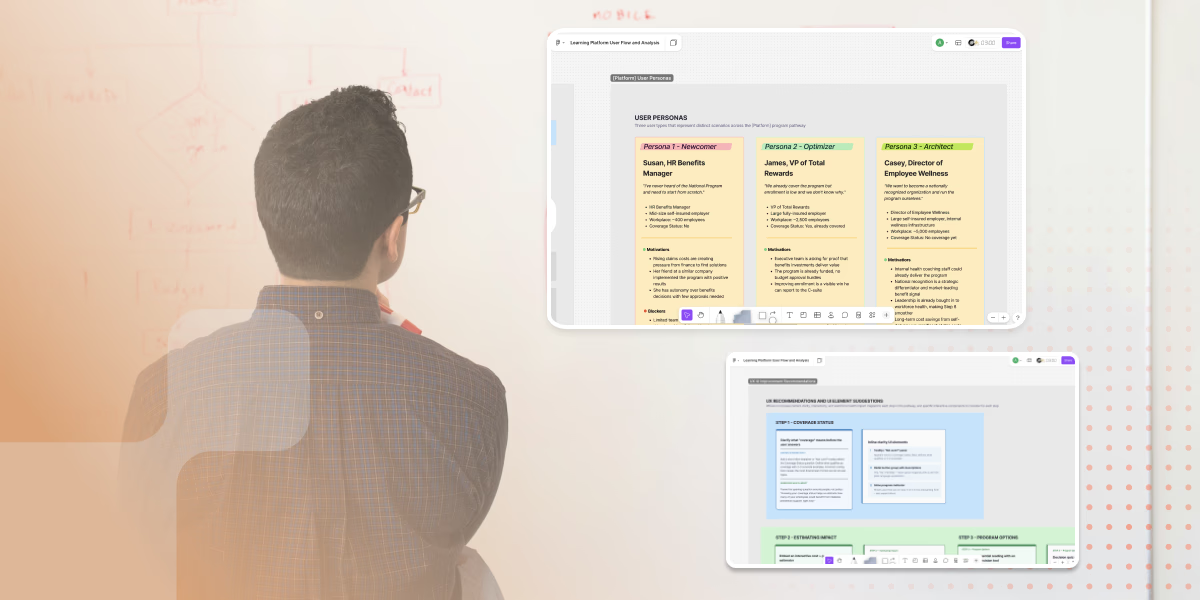
The [Platform] board maps three user personas moving through the same product:
-
Susan, an HR Benefits Manager starting from scratch with no knowledge of the National Program
-
James, a VP of Total Rewards whose organization already covers the program but has low enrollment
-
Casey, a Director of Employee Wellness who wants to become a nationally recognized provider and run the program in-house
They share a platform but have entirely different starting points, motivations, and sticking points. Dana needs education and reassurance. James needs data and a visible win for the C-suite. Susan needs a strategic path and a smoother leadership conversation.
The flow uses branching logic to route users based on their coverage status. That part works. But the deeper lesson is that persona-aware design isn't just about routing. It's about making sure the copy and context at each step actually speaks to the person in it.
When auditing a product experience, map it against each persona separately. Where does the flow feel right for one user and disorienting for another? Where does copy assume knowledge that only some users have? The gaps are usually where drop-off lives.
Empty States Are Not Neutral
A small but telling detail: when no Guide has been assigned to a user's account, the dashboard shows this message: "Your account has not yet been assigned a Guide. Please check back later."
The user has nothing to do and nowhere to go. They're told to wait, but not why or for how long.
The recommended update: "Looking for help? Contact [Platform] to request a Guide."
Empty states, error messages, and waiting screens aren't edge cases. They're guaranteed experiences for a real portion of your users. And they hit at moments of high uncertainty, when people are most likely to interpret ambiguity as a reason to leave.
What’s worth an analysis: what do users see when something is missing, loading, or unavailable? Does that state give them a next step, or does it leave them in a void?
The Through-Line: Language Is Design
What the [Platform] analysis keeps surfacing is that every piece of copy in a product is a design decision. Field labels direct attention. Opening lines set expectations. Microcopy at decision points determines whether users push through or give up.
The UX work that drives meaningful outcomes isn't always about wireframes. Sometimes it's about sitting with a single sentence and asking: does this tell the user what they need to know? Does it make the next step feel possible?
If the answer is no, you might not need a redesign. You might just need UX optimization.
Want to put this into practice? Start by mapping your existing flow against your core personas and reading the copy at each friction point as if you were the user encountering it for the first time. The gaps tend to show up fast.
Share this article


